

Landing pages play a major role in turning your online traffic into real results. Whether your goal is sign-ups, inquiries, or purchases, an effective landing page bridges the gap between curiosity and conversion. In this guide, we’ll explore what makes a great landing page, real-world examples that perform, and practical ways to apply these ideas to your own website.
A landing page is a standalone page designed to achieve a specific goal — often lead generation, sales, or event sign-ups. Unlike a homepage, which serves multiple purposes, a landing page focuses on one clear message and call to action.
It can be part of a paid campaign, an email funnel, or an organic marketing strategy that directs users toward conversion.
Landing pages are crucial because they create focus. They remove distractions, highlight the benefits of your offer, and speak directly to user intent. A well-designed landing page helps build trust, communicates value quickly, and increases conversion rates.
If you’re already investing in SEO or paid campaigns, a strong landing page ensures that your traffic doesn’t go to waste.
A well-built landing page typically includes these key components:
Each of these elements contributes to the overall user experience and helps users make quick, confident decisions.
For a more in-depth look at how design and SEO work together to drive conversions, explore our guide on building a strong SEO strategy.
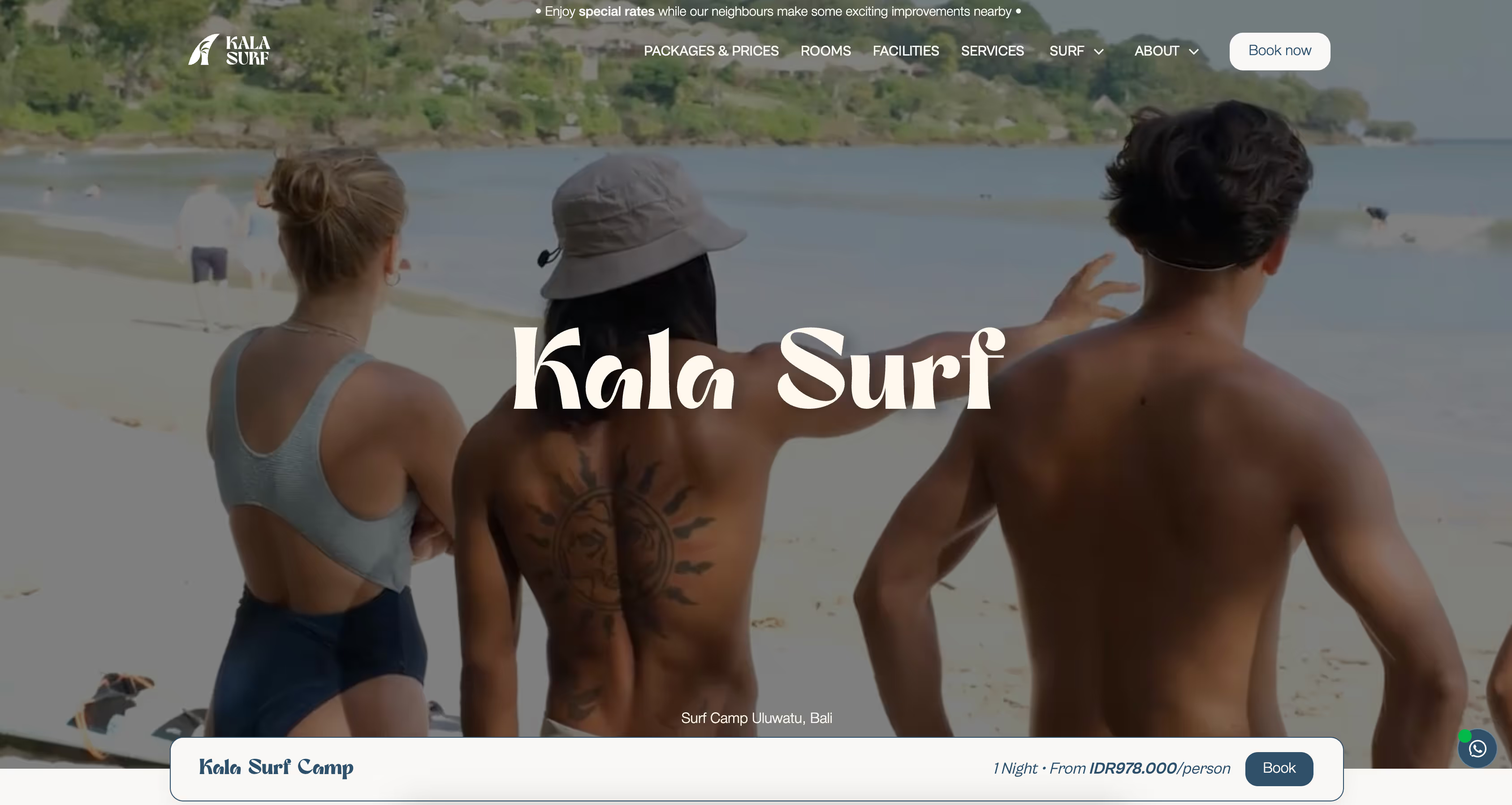
Let’s look at some of the best landing pages from global brands — and what you can learn from them.
Shopify’s landing pages are excellent examples of clarity and simplicity. The headline communicates the value instantly (“Start your business today”), supported by visuals that show ease of use. A single call-to-action button (“Start free trial”) stands out clearly.
What works: Minimal distractions, short copy, and strong visual focus on the offer.
Webflow’s landing pages stand out because they combine design flexibility with conversion-focused structure. Each page showcases real-world projects built on the platform, giving visitors inspiration and confidence to start building. The CTA “Get Started — it’s Free” is direct and repeated strategically throughout the page.
What works: Stunning visuals, clear hierarchy, proof through customer success stories, and interactive demos that build trust.
See Webflow’s examples at webflow.com/made-in-webflow.

HubSpot often uses landing pages to promote free templates, reports, and tools. Their forms are short, and the content gives users immediate value.
What works: Educational offers, clear CTA buttons, and visual trust indicators.
See examples on HubSpot’s marketing blog.
Unbounce is known for its landing page builder, and their examples show how design flexibility drives conversions. They use contrasting colors for CTAs, social proof in the form of testimonials, and clean layouts that prioritize readability.
What works: Consistent branding and optimized mobile layouts.
Explore their full showcase on Unbounce’s landing page library.
Airbnb landing pages focus on emotional appeal and social validation. The imagery is relatable, the copy feels personal, and the CTA is action-oriented (“Become a host”).
What works: Storytelling, trust signals, and human-centered design.
Slack’s landing pages are highly visual and minimalistic. They lead with product visuals and clear messaging that emphasizes teamwork and productivity.
What works: Direct copy, smart use of white space, and consistent design.
All these landing pages share one core principle: they simplify the decision-making process. They remove unnecessary elements and guide visitors toward one clear next step.
Key takeaways include:
For local or service-based businesses, these principles apply equally — especially when paired with local SEO strategies that drive qualified traffic to your landing pages.
Even if you’re not a large brand, you can implement the same proven tactics.
Decide exactly what you want users to do — sign up, book a call, download, or buy. Every part of the page should reinforce that goal.
Avoid talking about features. Focus on how your offer solves a problem or improves someone’s life.
Make your CTA stand out visually, and remove anything that competes for attention. Simple layouts with clear contrast convert better.
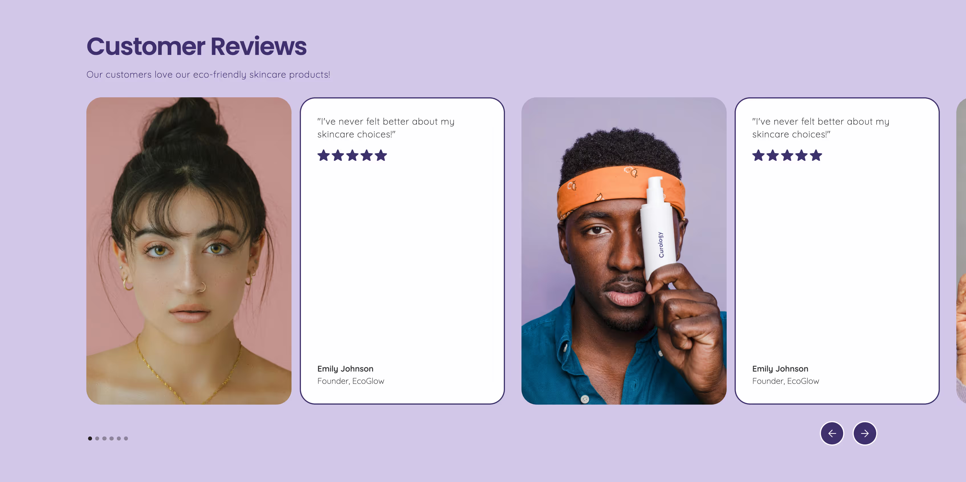
Add testimonials, client logos, and data that supports your claims. Transparency helps eliminate hesitation.
Run A/B tests on headlines, CTAs, and layouts. Use tools like CrazyEgg or Hotjar to see how visitors interact with your page.

When building landing pages in Webflow or any platform, consistency and structure are everything.
For design inspiration, check out how our clients optimize their pages in real-world SEO projects.
Q: What’s a good conversion rate for a landing page?
A typical conversion rate ranges from 5% to 15%, but it depends on your offer, traffic source, and audience intent.
Q: Should a landing page include navigation?
No. The best-converting pages keep visitors focused on the main call to action and remove external navigation links.
Q: How many CTAs should a landing page have?
One primary CTA, repeated a few times throughout the page, is ideal.
Q: What tools can I use to build landing pages?
Webflow, Unbounce, and HubSpot are all excellent for building responsive, customizable landing pages.
Q: Do landing pages affect SEO?
Yes. While most landing pages are built for conversions, optimizing for speed, relevance, and internal linking can still improve organic visibility.
Ready to Create a Landing Page That Converts?
At KeKu Design, we help businesses design, build, and optimize high-performing landing pages that turn visitors into customers.
Book your free discovery call and start improving your conversion strategy today.